Google Trends
Yet another Google tool that I use for my research to verify the potential profitability of a niche is Google Trends. The same or similar features used to be available as Google Insights (something I taught in my first Amazon training course a couple of years ago). Think of Google Trends like the Search Trends graph that I showed you in the Keyword Planner, except that Google Trends is a more general gauge (doesn't give you exact search numbers) but lets you see a longer period of time. You can use the tactics with Google Trends discussed in this chapter to simply verify the long-term health of your niche to help you decide if it is the right choice for your website. Access Google Trends here: On that page, just type in your keyword phrase at the top. You will then be shown a time-based graph for the popularity of searches on that keyword phrase - I've shown this below for the phrase down comforter guide.
Before you get too wrapped up in the results for the first graph shown, make sure the Limit settings on the left are set as desired. In particular, pay attend to the country setting - the Worldwide results for a phrase may be quite different from the results for the United States (if that is the country you are targeting on your site).
By simply changing Worldwide to United States in the Limit settings, my graph data looks to be a bit different:
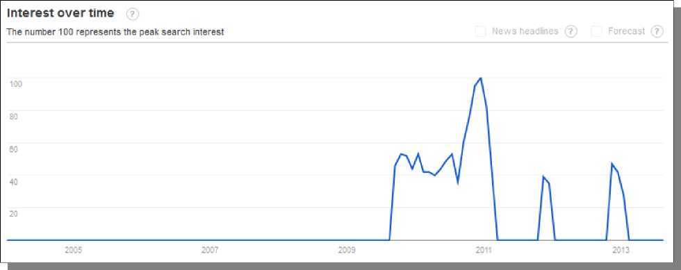
Initially, you may be thinking that this niche is on the decline over time, but you really can't make that judgment based on a single graph for one keyword phrase (especially when it is a more targeted phrase). You can hover over various points in the graph to find out the month and year as well as a number that relates to the peak interest level for that search phrase, with 100 being the peak level. By doing this, you can see that the spikes in traffic on this graph are the seasonal spikes each winter (which we also saw in the Keyword Planner Search Trends graph). Now, what should we make of the fact that winter of 2010 looks to be the peak year with a sharp decline the next year? First, winter of 2012 looks to show decent recovery over the previous year. You also must consider other factors, like the recent economic recession, which does seem to be slowly recovering now. On top of that, always think about whether your target keyword phrase actually represents the niche itself or just something specific about the niche. In this example, my phrase is about the product “down comforters” but I am also using the word “guide” on the end to target my site more. For this reason, I cannot simply look at the traffic for my phrase and gauge the health of the whole niche. If I change my search to just the basic niche name, “down comforter”, I can get a more accurate picture on the health of this niche. I have shown the graph from this below, which is targeted for just United States traffic:
This time, you really get much more information that you can use than with the previous search (although it is still good to know how your actual phrase is doing). This happens because Google Trends works off of search traffic volume, and it won't show any data unless the volume is high enough. Blank graphs, like at the beginning of the previous few graphs I have shown, could simply indicate lower volume and not ZERO volume! When I get more general with more search phrase but still staying closely related to my target niche, I get access to high volumes of search data to give me a better picture of the overall health of the niche. Now when I look at the graph above, I get a much different picture of the health of the down comforter niche overall. This graph shows the seasonal tendencies of this niche with much more clarity. Up through 2006 looked to be strong years with some declining years after that. By itself, that may be a negative sign, but those were basically the same years of the declining economy. In the winter of 2011 and 2012, the niche looks to be on the rise again and even looks to be just 10% short of historic levels before the economic decline. I believe this to be a good sign that the niche is regaining traffic (and likely sales) to previous levels as well. This coming winter (of 2013) could indeed see levels very close to old levels, which would obviously be great for any site targeting this niche. Below the graph, you can also see a map that shows the level of interest in various countries (or states, if you have selected a country for your search). There are also related search terms provided for you here, which you could use for even more research or ideas for targeting your site.
On the left, you get to see which USA states have the most interest for this niche and more options are available. This can be excellent information to use if you decide to do any advertising in your niche. On the right are the related terms but you can also view the rising terms in that same area to try to find trending products or sub-niches. © Google Research >>> Back to TABLE OF CONTENTS <<< | |
| Views: 519 | |


| Total comments: 0 | |