Element Layout, Positioning & Sizing
One of the most common things that I find myself using CSS to do on my websites is to control the layout and/or size of various HTML elements on the page. A number of CSS commands are available that allow you to do this, so I will be discussing those with you in this chapter. Element SizeIn general, if you want to have an HTML element on your page in a specific place, you will need to size your elements properly to get everything to line up how you want. Two primary CSS commands can be used to accomplish this: height and width. For either command, simply set a value as a number of pixels (px) or a percentage of the parent element. Without these commands, an HTML element will automatically size itself. Block elements like DIV tags will always take up 100% width unless otherwise specified, but the height of a DIV element is automatically calculated based on the amount of content in it. Inline elements will size the width to the content automatically. I will commonly use the DIV tag to create the layout of my entire website, so the height and width commands are very important to control the size of these elements so they are not automatically sized for me. I have provided an example of these two commands below, where I have set both the height and width of a DIV tag to be 250px:
Element LayoutWhen you create DIV tags that have specific widths, they will still line up one on top of the other even if there is enough space for them to line up next to each other. This happens because DIV tags are block elements. You can change this default behavior with CSS to make DIV tags line up next to each other instead with the command float. When you set the value of this command to left or right, you are forcing the DIV tag to become an inline element. A value of left causes the element to align to the left and right causes the element to align to the right - both of these alignments take place within the available work space and not necessarily within the scope of the entire page. By using this one command with sized DIV tags, you can cause the tags to line up next to each other (just be sure there is enough horizontal space in the page to accommodate the tags). I have provided an example of this below:
As you can see, both elements use a float value of left. This causes them to line up directly next to each other without space between them. As I mentioned before, you simply need enough horizontal space to hold the elements. If there is not enough horizontal space, the elements will simply start on a new line. I have provided another example below that shows how this works:
In this example, I have four DIV tags contained within another DIV tag. The parent DIV tag is 500 pixels wide, while each of the children tags are 250 pixels wide and set to float to the left. Since there is only 500 pixels of total width for these DIV tags to float within, there is only room on a single line for two of the DIV tags. As a result, the second two DIV tags would automatically drop to the second line. This would essentially create a 2x2 grid of DIV tags on the page. It is very important to remember that anytime you use a float, you must also clear that float once you are done with it! This is done with the clear command. You can use a value of both to clear both floats, or you can simply use a value of either left or right to just clear one float. I have provided two different examples below to show you what happens when you don't clear a float:
As you can see from this example, clearing the float prevents anything from showing up on the same line as the floated element(s). Without clearing the float, the next element/text will still show up as an inline element. Element PositioningCSS also provides an easy way to position your elements on the page. This can be especially useful for special situations where you want an HTML element to behave abnormally on your page. A great example of this is the black WordPress toolbar that is at the top of the page when you are logged into a WordPress site. Ever notice how this toolbar is always at the very top of the page, even when you scroll down the page? This is accomplished with CSS positioning using three commands: position, left and top. The position command defaults to the value of static, which makes an element show up as normal. The fixed value positions the element relative to the browser window. The relative value positions the element relative to its normal location on the page. The absolute value positions the element relative to the first non-static positioned parent element on the page. The commands left and top are used with a value in pixels (px) that represents how much space to offset the element according to the positioning rules that are set for it (because of the position command value). The easiest way to understand positioning is with an example:
This element is set to a fixed position with both a left and top value of 0 pixels. This causes the element to get displayed at the top of the page at all times (just like the WordPress admin toolbar I mentioned before). I have created another example below to go a bit deeper into positioning with CSS:
In this example, I have two DIV tags, both using the position command. The first DIV is using a value of relative. With a left value of 100px and a top value of 0px, this element will be moved 100 pixels to the right in the content relative to its normal position on the page. The second DIV element is using a value of absolute for the position, which causes its position to be relative to the first parent element with a non-static position (the first DIV, in this case). With a left value of -100px and a top value of 0px, this second DIV will show up 100 pixels to the left of the first DIV element. Element Padding & MarginsWithout CSS coding, elements like DIV tags will not have any padding or margins. The lack of margins allows the DIV tags to sit directly against other DIV tags. This can be convenient to use when building a site layout, but there are other times when you will want to have margins to provide some space between elements. The easiest way to understand margins and padding is to think of margins as being the spacing outside of an element and padding as being spacing inside of an element. To create a margin around the outside of an element, use the margin CSS command. The value should be a number of pixels, which is the amount of space added to the outside of the element on all sides. You can also add margins one at a time with commands like margin-top, margin-bottom, margin-left and margin-right. Padding works the same way except that it is spacing inside of an element and uses the command padding. If your element has a border, padding will show up as spacing between the border and the content in the element. I have created an example below to show padding and margins being used. I have also used the border command in this example so that the padding and margins can be more easily seen. I will explain borders in more detail in the next chapter:
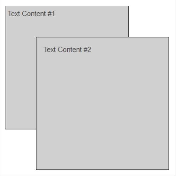
The first DIV tag has padding and spacing of 5px, while the second has 15px for both. As you can see from the differences between the two, the margin alters where the element is displayed on the page and the padding alters where the content in the element is displayed. Element LayeringThe z-index command can be used when your page elements are moved on top of each other (using the position command). The z-index command accepts a number as the value, and then elements will be stacked on the page starting with the lowest z-index number and working up to the highest z-index number. Using this command makes it possible to layer your elements instead of forcing everything to sit next to each other. I have created an example below that shows how this works:
This example is a total of 3 DIV tags, each one inside of the next. The first DIV is a placeholder that is stretching enough vertical space to contain the other two DIVs. Without this, you would find that some of the content would be cut off from the bottom of the display (at least when used within the content of a WordPress page). The second and third DIVs are very similar to those that I created in the previous example, except that I have positioned these so that one lays on top of the other. I also added a background color (which will be explained in more detail in the next chapter) so that the boxes wouldn't be see-through. The second DIV is positioned relative and does not have its actual position altered (this is needed for positioning the third DIV). The z-index is set to 10 for this DIV. With the third DIV, the position is set to absolute, which sets its position with the parent element. I then move the element to right and down 50 pixels (top:50px and left:50px). With a z-index of 20, this element is displayed on top of the parent element. © CSS Training Guide >>> Back to TABLE OF CONTENTS <<< | |
| Views: 465 | |

| Total comments: 0 | |